Customize loading screen
Customize rooomSpaces loading screen with your logo and branding. Learn URL parameters and advanced styling for personalized viewer experience.
A loading screen is the first thing presented in viewers whilst the 3d space are being downloaded. Therefore, you might want to fancy it up with your own logo and color scheme.
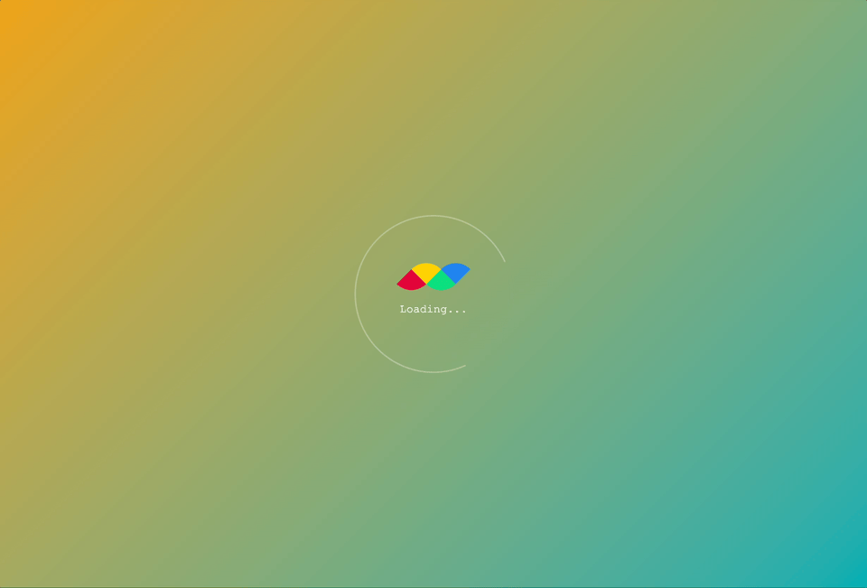
While there are URL parameters to customize the default loading screen, it is possible to tailor the look of it even more to your unique needs. Here we will guide you through the steps to customize the loading screen. The final look of the screen will look like this.
TIP
Look at the following URL parameters you need rather simple tweaks of the loading screen: ui_progress_minimal, ui_progress_color, ui_progress_logo, ui_progress_bg, ui_progress_bg_color.
Base Structure
Here is the basic structure of our loader.
<iframe id="iframe"></iframe>

<div id="container">
  <div id="spinner"></div>
  <div id="logo-text">
    <img id="logo" src="[PATH_TO_YOUR_LOGO_IMAGE]" alt="my-logo" />
    <p id="text">Loading...</p>
  </div>
</div>
The first element is the iframe for the rooom viewer. The custom loader will then be displayed as an overlay element, in a container. In the container, there's a centered set of elements: a spinner, a logo, and a text. Here we simply wrote "Loading..." as a loader text.
For the logo, you can either provide a path to an image as a img element's source, or directly insert an svg code.
Timing the loading screen
To display the loading screen at the right time, i.e. right after the initialization and before the start of the viewer, we listen to the viewer.start event of the Viewer API.
const iframe = document.getElementById("iframe");
const viewer = new SpaceViewer(iframe);
viewer.init("f7ef4851b8", {
  autostart: true,

  onSuccess: (api) => {
    document.getElementById("container").style.visibility = "visible";
    api.on("viewer.start", () => {
      document.getElementById("container").style.visibility = "hidden";
    });
  },
});
When the viewer is successfully initialized, the onSuccess callback will be invoked. This is where we set our custom loading screen's visiblity to visible.
Then, when the viewer starts and viewer.start event is triggered, the visiblity of the loading screen is set to hidden again. This way, we successfully replace the default loading screen.
Styling the loader
Positioning the elements
#container {
  position: absolute;
  top: 0;
  left: 0;
  width: 100%;
  height: 100%;
  display: grid;
  grid-template: "container";
  place-items: center;
  place-content: center;
  overflow: hidden;
  color: #fff;
  background-image: linear-gradient(-45deg, #00aeb3, #eda315);
  /* background-image: url(PATH_TO_YOUR_BG_IMAGE);
  background-repeat: no-repeat;
  background-size: cover;
  background-position: center center; */
}

#container > * {
  grid-area: container;
}
Here we make sure that the container fills up the whole screen of the viewer iframe, by setting the top, left to 0, and its width and height set to 100%. Then using the grid layout, we position all items to be in the center.
As a background, we simply use the linear-gradient to make a simple yet nice looking gradient background. You can also use this by changing the colors you want. In case you want to use your own background image, you can also provide the path to the image instead. (See the commented code block.) Note, in this case, you also have to set background-repeat, background-size, background-position properties accordingly to center and fill the background space with the image.
The color property determines the text color of the loader. (i.e. "Loading...")
Placing the logo and the text
#logo-text {
  place-self: center center;
  display: flex;
  flex-direction: column;
  align-items: center;
  justify-content: center;
}
The set of logo and the text is centered again using a flex layout.
Animating the spinner
#spinner {
  place-self: center center;
  width: 220px;
  height: 220px;
  border-radius: 9999px;
  border: 2px solid rgba(255, 255, 255, 0.3);
  border-bottom-color: transparent;
  transition-timing-function: linear;
  -webkit-animation: spin 1.5s linear infinite;
  animation: spin 1.5s linear infinite;
}

@-webkit-keyframes spin {
  0% {
    -webkit-transform: rotate(0deg);
  }

  100% {
    -webkit-transform: rotate(360deg);
  }
}

@keyframes spin {
  0% {
    transform: rotate(0deg);
  }

  100% {
    transform: rotate(360deg);
  }
}
The spinner we are creating has the diameter of 220px, and the spinning part will be displayed as a border with its bottom bit being transparent.
And now... using a simple animation defined as spin, our new loader goes spinnin'!
Note
Check out the full code on playground.